
Part 1 of 5: React Native Coding Challenges
Create a Navigation Bar with Multiple Tabs that Switch Between Views... in React Native & Implement a Form With Validation and Error Handling


Challenge 1: Create a Navigation Bar with Multiple Tabs that Switch Between Views... in React Native!
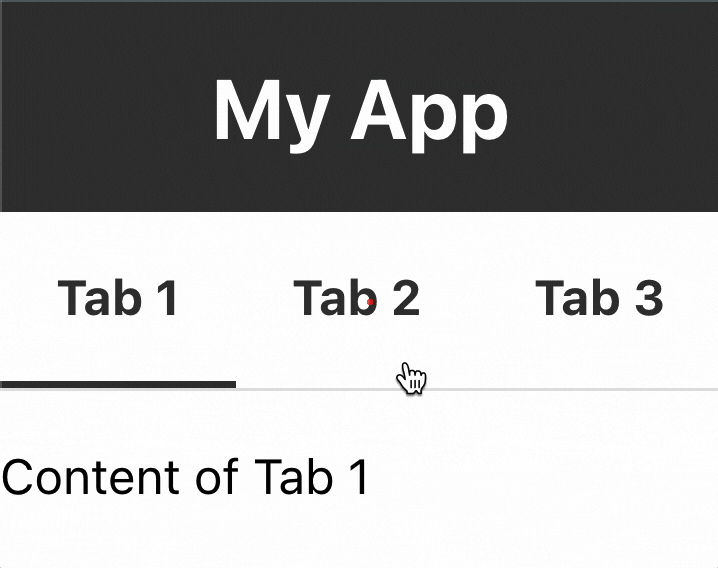
Here's what we are aiming for. I encourage you to try and replicate this before proceeding 👍!
Ok! Let's Dive in!!!
To create a navigation bar with multiple tabs that switch between views in React Native, we can use the react-navigation library. Here's an example of how to do it:
- First, let's set up the
react nativeapp and install thereact-navigationlibrary using the following command:
npx create-expo-app rn-navbar

cd rn-navbar
- Next, install the necessary dependencies for the navigation library using the following command:
npm install @react-navigation/native react-native-reanimated react-native-gesture-handler react-native-screens react-native-safe-area-context @react-native-community/masked-view
Here is an overview of what each package provides:
@react-navigation/native: This package provides a set of tools for building navigation in a React Native app. It allows you to easily set up and manage navigation between different screens and views in your app, with features like tab navigation, stack navigation, and drawer navigation. With this package, you can create a consistent and intuitive navigation experience for your users.react-native-reanimated: This package provides a way to create smooth and performant animations in your React Native app. It's built on top of the Animated API provided by React Native, but adds more advanced features like declarative syntax and interpolation. You can use this package to create complex animations for things like loading screens, transitions between views, or interactive UI elements.react-native-gesture-handler: This package provides a set of components and utilities for handling touch gestures in your React Native app. It allows you to easily create touchable elements like buttons or sliders, as well as more complex interactions like swiping or dragging. With this package, you can create a more responsive and interactive user interface for your app.react-native-screens: This package provides a set of native components for rendering screens in your React Native app. It's designed to improve performance and memory usage by using native components instead of JavaScript-based ones. You can use this package to create high-performance screens for your app, especially if you have a lot of content or complex UI elements.react-native-safe-area-context: This package provides a way to handle the safe area insets in your React Native app. Safe areas are the parts of the screen that are not covered by notches, status bars, or other system elements. With this package, you can easily adjust the layout of your app to account for these safe areas, and ensure that your UI elements are always visible and usable.@react-native-community/masked-view: This package provides a way to create masked views in your React Native app. Masked views allow you to display content inside a masked area, which can be any shape or size. You can use this package to create interesting and visually appealing UI elements, like circular profile pictures or custom-shaped buttons.
App.js
- Import the necessary components from the
react-navigationlibrary and create a stack navigator with the desired screens:
import NavigationBar from './NavigationBar';

function App() {
  return (
     <NavigationBar />
  );
}
export default App;
- In App.js, we are simply importing
NavigationBarand rendering it on the UI.
The magic happens in NavigationBar.js...
NavigationBar.js
// import necessary modules
import React, { useState } from 'react';
import { StyleSheet, View, Text, TouchableOpacity } from 'react-native';

// define tab configurations
const TABS = [
  { title: 'Tab 1', component: <View><Text>Content of Tab 1</Text></View> },
  { title: 'Tab 2', component: <View><Text>Content of Tab 2</Text></View> },
  { title: 'Tab 3', component: <View><Text>Content of Tab 3</Text></View> },
];

// define the navigation bar component
const NavigationBar = () => {
  // define state for the active tab
  const [activeTab, setActiveTab] = useState(0);

  // define function to handle tab presses
  const handleTabPress = (index) => {
    setActiveTab(index);
  };

  // render the navigation bar
  return (
    <View style={styles.container}>
      {/* render the header */}
      <View style={styles.header}>
        <Text style={styles.headerTitle}>My App</Text>
      </View>
      {/* render the tabs */}
      <View style={styles.tabs}>
        {TABS.map((tab, index) => (
          <TouchableOpacity
            key={index}
            style={[
              styles.tab,
              activeTab === index && styles.activeTab,
            ]}
            onPress={() => handleTabPress(index)}
          >
            <Text
              style={[
                styles.tabTitle,
                activeTab === index && styles.activeTabTitle,
              ]}
            >
              {tab.title}
            </Text>
          </TouchableOpacity>
        ))}
      </View>
      {/* render the active tab content */}
      <View style={styles.contentContainer}>
        {TABS[activeTab].component}
      </View>
    </View>
  );
};

// define styles for the navigation bar
const styles = StyleSheet.create({
  container: {
    backgroundColor: '#fff',
  },
  header: {
    height: 60,
    justifyContent: 'center',
    alignItems: 'center',
    backgroundColor: '#333',
  },
  headerTitle: {
    fontWeight: 'bold',
    fontSize: 24,
    color: '#fff',
  },
  tabs: {
    flexDirection: 'row',
    alignItems: 'center',
    borderBottomColor: '#e0e0e0',
    borderBottomWidth: 1,
  },
  tab: {
    padding: 16,
    borderBottomWidth: 2,
    borderBottomColor: 'transparent',
  },
  activeTab: {
    borderBottomColor: '#333',
  },
  tabTitle: {
    fontWeight: 'bold',
    color: '#333',
  },
  activeTabTitle: {
    color: '#333',
  },
  contentContainer: {
    flex: 1,
    marginTop: 16,
  },
});

export default NavigationBar;
Code Review
This code defines a navigation bar component for a mobile app with three tabs. It uses React and the react-native library.
The
TABSconstant defines an array of objects with each tab's title and content.The
NavigationBarcomponent defines a state for the active tab and a function to handle tab presses. It renders the header, tabs, and active tab content.The
stylesobject defines the styles for the navigation bar, including the header, tabs, and content.The
export defaultstatement exports theNavigationBarcomponent to be used in other parts of the app.
FINAL NOTE
You may have to install the iOS Simulator or Android Emulator, or to get it running on the web: try this in the terminal:
npx expo i react-native-web@~0.18.10 @expo/webpack-config@^18.0.1
Challenge 2: Implement a form with validation and error handling.
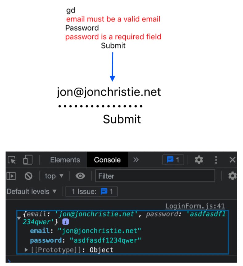
Here's what we are aiming for. I encourage you to try and replicate this before proceeding 👍!
Here's an example of how to implement a form with validation and error handling in React Native.
Setup
First, let's install React Native and set up the app:
npx create-expo-app rn-form
cd rn-form
- Next, install the Formik library, which simplifies the process of creating forms and handling their state:
npx expo i react-native-web@~0.18.10 @expo/webpack-config@^18.0.1

npm i formik yup
LoginForm.js step-by-step
import React from 'react';
import { Text, TextInput, TouchableOpacity, View } from 'react-native';
import { Formik } from 'formik';
import * as yup from 'yup';
- Define the validation schema using Yup, a library for data validation:
const validationSchema = yup.object().shape({
  email: yup.string().email().required(),
  password: yup.string().required(),
});
- Define the form fields, including their names, initial values, and error messages:
const initialValues = { email: '', password: '' };
const fields = [
  {
    name: 'email',
    placeholder: 'Email',
    keyboardType: 'email-address',
    autoCapitalize: 'none',
    autoCorrect: false,
    errorMessage: 'Please enter a valid email',
  },
  {
    name: 'password',
    placeholder: 'Password',
    secureTextEntry: true,
    errorMessage: 'Please enter your password',
  },
];
LoginForm.js
import React from 'react';
import { Text, TextInput, TouchableOpacity, View } from 'react-native';
import { Formik } from 'formik';
import * as yup from 'yup';

// Define a validation schema for the form fields
const validationSchema = yup.object().shape({
  email: yup.string().email().required(),
  password: yup.string().required(),
});

// Define initial values for the form fields
const initialValues = { email: '', password: '' };

// Define an array of objects that describe the form fields
const fields = [
  {
    name: 'email',
    placeholder: 'Email',
    keyboardType: 'email-address',
    autoCapitalize: 'none',
    autoCorrect: false,
    errorMessage: 'Please enter a valid email',
  },
  {
    name: 'password',
    placeholder: 'Password',
    secureTextEntry: true,
    errorMessage: 'Please enter your password',
  },
];

// Define the LoginForm component
const LoginForm = () => {
  return (
    // Wrap the form with Formik and pass the initial values and validation schema as props
    <Formik
      initialValues={initialValues}
      validationSchema={validationSchema}
      // Define the submit function that will be called when the form is submitted
      onSubmit={(values) => console.log(values)}
    >
      {/* Pass a function as a child to Formik that renders the form fields */}
      {({ handleChange, handleBlur, handleSubmit, values, errors }) => (
        <>
          {/* Loop through the array of fields and render each one */}
          {fields.map((field) => (
            <View key={field.name}>
              {/* Render a TextInput for each field */}
              <TextInput
                name={field.name}
                onChangeText={handleChange(field.name)}
                onBlur={handleBlur(field.name)}
                value={values[field.name]}
                placeholder={field.placeholder}
                keyboardType={field.keyboardType}
                autoCapitalize={field.autoCapitalize}
                autoCorrect={field.autoCorrect}
                secureTextEntry={field.secureTextEntry}
              />
              {/* Render an error message for each field */}
              <Text style={{ color: 'red' }}>{errors[field.name]}</Text>
            </View>
          ))}
          {/* Render a button to submit the form with an onPress handler that calls the handleSubmit function */}
          <TouchableOpacity onPress={handleSubmit}>
            <Text>Submit</Text>
          </TouchableOpacity>
        </>
      )}
    </Formik>
  );
};

// Export the LoginForm component
export default LoginForm;
App.js
import React from 'react';
import { StyleSheet, View } from 'react-native';
import LoginForm from './LoginForm';

const App = () => {
  return (
    <View style={styles.container}>
      <LoginForm />
    </View>
  );
};

const styles = StyleSheet.create({
  container: {
    flex: 1,
    alignItems: 'center',
    justifyContent: 'center',
  },
});

export default App;
When you run the app, you should see a form with two input fields and a "Submit" button. The input fields will be validated according to the defined schema, and any errors will be displayed below the corresponding fields. If the form is submitted successfully, the form values will be logged into the console.
Conclusion
The code snippets provided demonstrate the implementation of key UI components in a React Native application, namely a navigation bar with multiple tabs and a form with validation and error handling. The NavigationBar component uses the useState hook to manage the active tab and switches between different views based on the selected tab. The LoginForm component uses the Formik library and the yup validation schema to handle form input and validation. Both components use StyleSheet to define their styles in a concise and scalable manner. These examples provide a foundation for creating more complex UI components and forms in React Native applications. When used in conjunction with other features like React Navigation, developers can create rich and intuitive mobile apps with ease.
I hope you enjoyed Part 3 of the Series! Check out the code using the links below and please ⭐️ the GitHub Repo if you found some value!
WORKING CODE:
Create a navigation bar with multiple tabs that switch between views
Implement a Form With Validation and Error Handling
Jon Christie
jonchristie.net
